


![]()
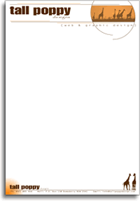
Obviously my own letter head. It fits in with what I have done with the website and the business card, so anyone can easily see that all of them are connected.
![]()
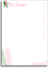
Soft vibrant colours were the call for this one. Except for the logo the other colours are very faint, which creates the soft tones, but the pink still keeps it vibrant.
![]()
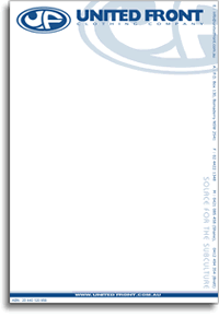
As with the other material United Front has gotten me to design the priority was that the logo stands out.
![]()
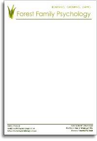
A fairly basic design to keep with the professional image that Forest Family wanted to portray.
